The use of mobile devices for internet surfing has been increasing at an accelerating rate. If you are a web developer or a web designer the increased use of mobile devices is a good reason to future-proof your website. This would allow your site to render properly on different mobile devices with their own respective screen sizes. To make the transition easier, using GridFlair can make the job easier for you.
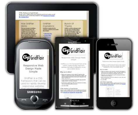
The proliferation of new mobile devices and platforms is a boon to web designers. It is also the cause of a big problem. Most of these new devices have their own screen sizes. The old approach would be to write device-specific web pages. Using conditionals, code is generated for a specific Samsung model, Blackberry or a Kindle device. Including all these conditions for all available devices is a never-ending task, specially considering that new devices are continuously being introduced to the market.
Rather than customizing web sites to be compatible for each make and model, we can design the website "adapt" to any media device. Developing a one-size-fits-all website would lead to future-proof code which will properly render on any mobile device, including those already in existence as well as those which would be introduced in the future.
Thanks to CSS3 media queries, creating a responsive website has never been easier.
What is CSS3 Media Queries
Media queries is a CSS3 module that allows designers and developers to use a device's media feature to conditionally control how styles are applied. With a media query, the code checks for a device's or browser's screen size, and automatically adjusts accordingly.
Take a look at the CSS examples below:
@media only screen and (max-width: 580px) {
background-color: green;
}
@media only screen and (max-width: 320px) {
background-color: blue;
}
The first media query expression above tells the browser to use green background if the screen width is 580 pixels or less. The other expression tells the browser to use the blue background if the screen width is 320 pixels or less. This CSS3 media query feature allows designers to create one stylesheet file to control the layout and styles of the page depending on the device media feature.
Introducing GridFlair
GridFlair is a responsive web design framework based on CSS3 media queries. The idea is to build small responsive blocks and to put all these responsive blocks together to create a fully responsive website.
Whether for personal or commercial websites, GridFlair is FREE to use under the Creative Common Attribution 3.0 License.
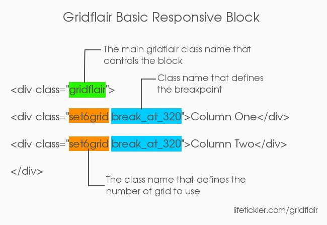
In creating a responsive block, there are only three class names to remember. With those three required classes, there is no need to compute for column sizes.
- gridflair - the main class which goes by the same name as the framework
- setNgrid - this class defines the column grid, where N is any number from 1 to 12
- break_at_M - this class defines the column breakpoint, where M is the size of the screen
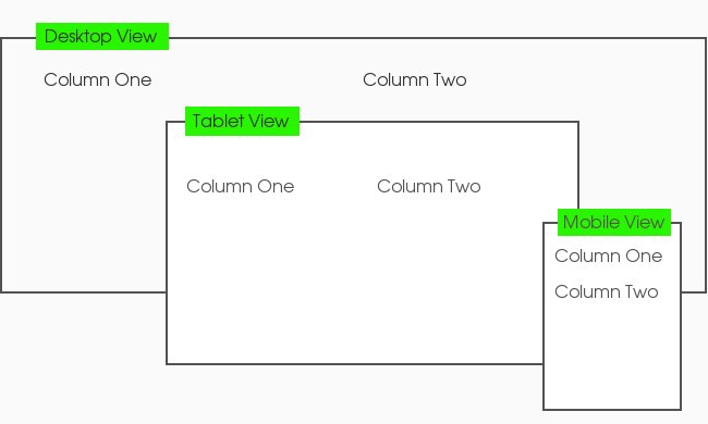
Creating a responsive block in GridFlair is dead simple. Below is an example of a GridFlair block:
The above html code has different effects when viewed at different screen sizes.
Now that you know what GridFlair can do, let's discuss in detail how it can be used to create a basic responsive block.
The Grid: Explained
GridFlair is based on a 12 column grid. To create the required number of columns, we must define how many grids each column must have and make sure the total is equal to 12 grids.
The image below shows how the 12 column grid system works:
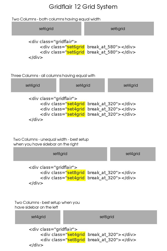
Remember that the columns must always add up to 12 grids, otherwise the content will not display properly.
Breakpoints: Telling The Columns To Break At Certain Screen Widths
GridFlair responds to commonly-used breakpoints. The following class names can be used:
- break_at_1000
- break_at_800
- break_at_768 - Ipad portrait
- break_at_600 - Android landscape, Kindle portrait
- break_at_568 - iPhone 5 landscape
- break_at_480 - iPhone 3+4 landscape, Android portrait
- break_at_320 - iPhone 3+4 portrait, iPhone 5 portrait, Android landscape, Android portrait
If we want to create a block with two columns that break at 320 pixels, here is how it is done in GridFlair:
<div class="gridflair">

     <div class="set6grid break_at_320">

          Lorem ipsum dolor sit amet, consectetur adipisicing elit

     </div>

     <div class="set6grid break_at_320">

          sed do eiusmod tempor incididunt ut labore et dolore magna aliqua

     </div>

</div>
The browser interprets the code this way:
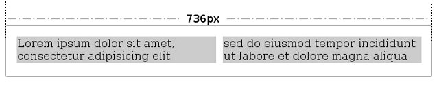
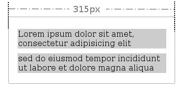
In the above example, the gray background shows the columns used. The break_at_320 classname is used to indicate the column break at 320 pixels. The result would be the same on a 315 pixel screen size since the responsive effect covers a screen size of 320 pixels in width or less.
Although the above mentioned breakpoints are the most commonly used, GridFlair has provisions for customizing for use with other screen sizes, and corresponding breakpoint values which we will discuss later.
The Nesting Approach
Another powerful HTML code featured in GridFlair is nesting. This means we can put a block inside another block. Putting all these responsive blocks together in a nested approach is what makes creating a fully responsive website an easy task. Here's an example:
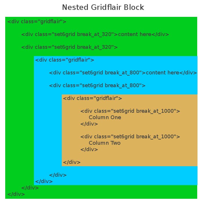
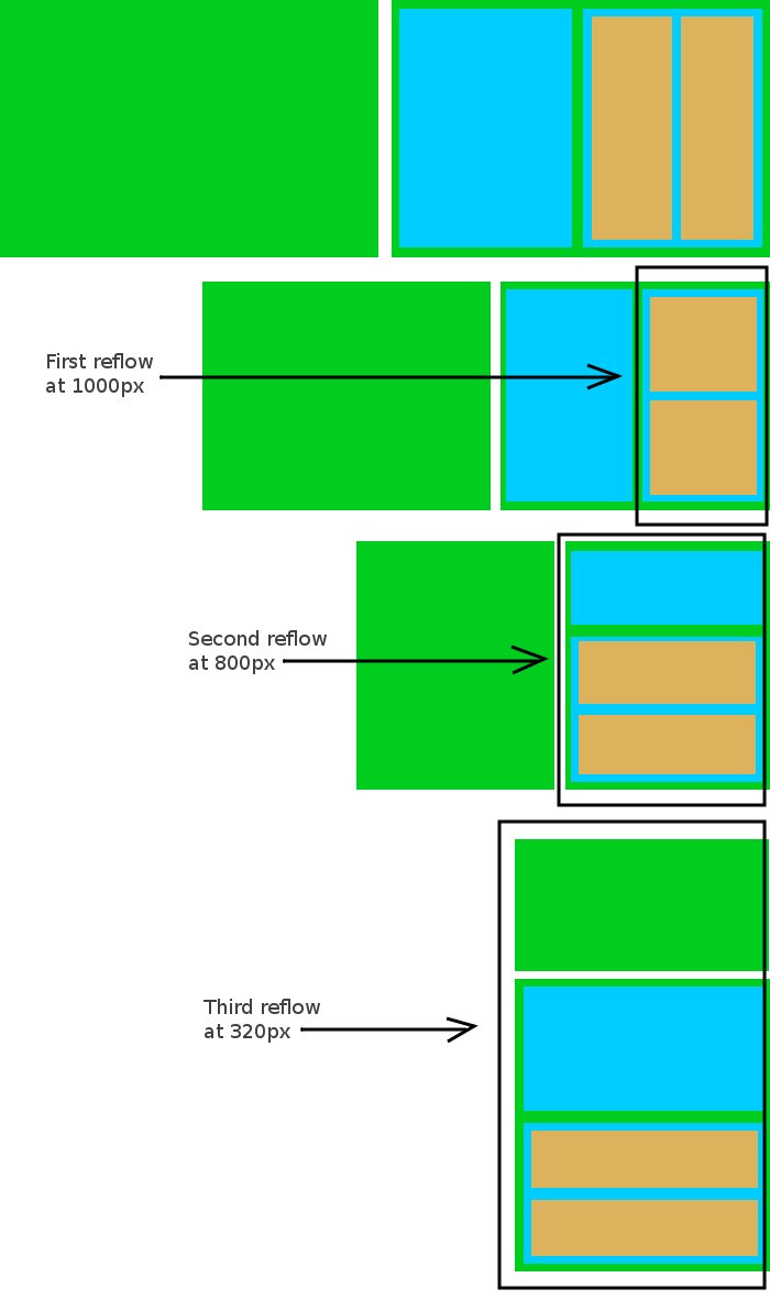
The sample code above will have multiple blocks nested. The innermost code will have a breakpoint at 1000 pixels, with another breakpoint at 800 pixels, and a parent block at 320 pixels. Below is how this will be interpreted at different screen sizes:
The Layout: Planning How The Whole Website Reflow At Different Screen Sizes
With the above information on GridFlair, you should be able to create a responsive web page. We can begin by creating a layout and see how it works with 3 screen sizes: 800px, 580px and 320px.
The layout at 1200-pixel screen
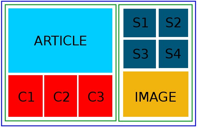
In the above illustration, the blue line shows the maximum website width, and the green line designates the main page division for a two column website.
The layout at 800 pixel screen
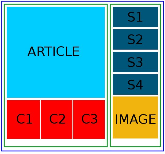
Notice how s1,s2,s3 and s4 rearranges in one column to fit the 800 pixel screen.
The layout at 580 pixel screen
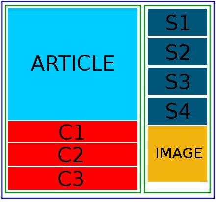
Notice how the c1,c2 and c3 rearranges to fit the 580 pixel width screen.
The layout at 320 pixel screen
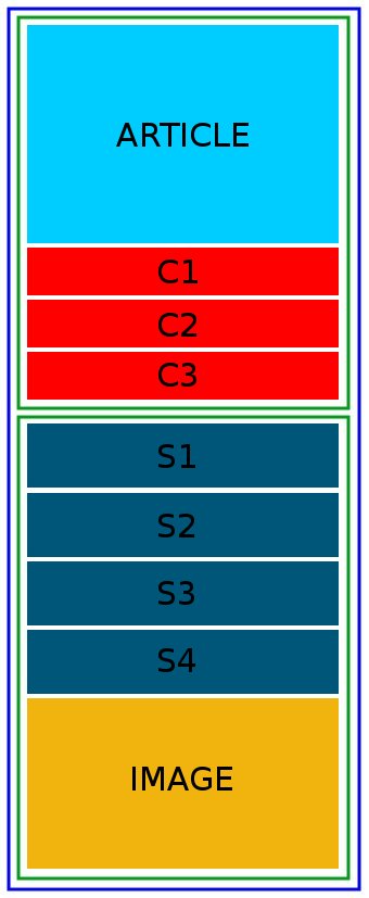
All sections rearrange into one column to accommodate the small screen.
The Fun Part: Writing The HTML Code
There are preliminary several steps needed for coding a responsive website. Firstly, we need to optimize the website for mobile viewing.
<meta name="HandheldFriendly" content="True">

<meta name="MobileOptimized" content="320">

<meta name="viewport" content="width=device-width, initial-scale=1.0">
To institute the use of GridFlair, the css file has to be linked.
<link rel="stylesheet" href="reset.css" media="all">

<link rel="stylesheet" href="gridflair_v3.css" media="all">

<link rel="stylesheet" href="custom.css" media="all">
- reset.css - CSS file needed to ensure website compatibility with different browsers.
- gridflair_v3.css - The CSS file includes the GridFlair version 3.0 framework.
- custom.css - The file contains your own design parameters. Keep your own css codes separate from GridFlair.
It is important that the files are called out in order. The reset.css file has to be invoked first, followed by the GridFlair framework, and lastly by your custom.css file. You might have a valid reason to combine these files into one, however keep the same order of call out.
Custom.css contains all your other customizations, including any override to gridflair.css. You don't need to change anything in gridflair.css.
The following is how the whole <head> </head> section looks like:
<!doctype html>
<!--[if lt 9 ]> <html class="ie"> <![endif]-->
<!--[if gte IE 9 ]><!--> <html> <!--<![endif]-->
<head>
<meta charset="utf-8">
<meta http-equiv="X-UA-Compatible" content="IE=edge,chrome=1" />
<title>Title Of Your Page</title>
<meta http-equiv="cleartype" content="on" />
<meta name="description" content="Description of your page" />

<link rel="shortcut icon" type="image/x-icon" href="images/favicon.ico" />

<meta name="HandheldFriendly" content="True" />
<meta name="MobileOptimized" content="320" />
<meta name="viewport" content="width=device-width, initial-scale=1.0" />

<link rel="stylesheet" href="reset.css" media="all">
<link rel="stylesheet" href="gridflair.css" media="all">
<link rel="stylesheet" href="custom.css" media="all">

</head>
As suggested by Paul Irish in his HTML conditional classes, the conditional statements after the doctype are included for backward compatibility with Internet Explorer versions which are older than version 9. The above listing is the bare minimum, for more advanced setup, see HTML5 Boilerplate.
The following are the steps to use GridFlair in creating responsive blocks in your HTML code:
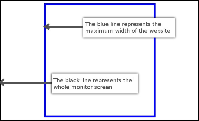
Step 1. Set The Maximum Width Of The Website (The Blue Line)
For design considerations, web pages are not bleed-to-bleed. These do not take up the whole available width. Setting the maximum width limits the web page to a size less than the screen size.
Inside the <body> tag, a wrapper class is set, like the example below:
<body>

<div class="wrapper">

... put everything inside here

</div>

</body>
The wrapper class is defined in the custom.css as follows:
.wrapper {
	width:90%;

	max-width:1200px;

	margin:auto;
}
In the example above, the width is nominally set to 90% in order to provide some space for the left and right margins when viewed on narrow screen sizes, especially those found on tablets and mobile devices. The max-width variable is the maximum space which the web page will occupy, even if the actual screen size is wider than 1200 pixels. The margin:auto sets the web page contents centered in the browser.
Step 2: Setting The Main Columns
Next, we set the columns, which henceforth we refer to as the green line. The first and wider column serves as the main column for the content, while the second column occupies the rest of the allowable space. To make the first column wider, we use the set8grid class. The set4grid class is used for the second column. The two columns are a total of 12 grids wide.
<div class="wrapper">


	<div class="gridflair">

		<div class="set8grid break_at_320"></div>

		<div class="set4grid break_at_320"></div>

	</div>


</div>
Step 3. Setting The Sidebar
After setting the main columns, we set the sidebar and its contents, represented by s1, s2, s3 and s4, with one large image below them.
<div class="gridflair">
	<div class="set6grid break_at_800">s1</div>
	<div class="set6grid break_at_800">s2</div>
</div>

<div class="gridflair">
	<div class="set6grid break_at_800">s3</div>
	<div class="set6grid break_at_800">s4</div>
</div>


<img alt="" src="images/example.jpg" />
Step 4. Setting The Main Content
<div class="content">ARTICLE</div>
The page layout has the main article box inside the first column. Since article is contained inside a one column container (div with a class name "content"), there is no need for a gridflair block.
Step 5. Setting The Boxes Below Content (c1, c2, c3)
<div class="gridflair">

	<div class="set4grid break_at_580">c1</div>

	<div class="set4grid break_at_580">c2</div>

	<div class="set4grid break_at_580">c3</div>

</div>
Putting Them All Together
Nesting the code, the whole HTML file looks like this (the colors should be your guide):
<!doctype html>
<!--[if lt IE 9 ]> <html class="ie"> <![endif]-->
<!--[if gte IE 9 ]><!--> <html> <!--<![endif]-->
<head>
<meta charset="utf-8">
<meta http-equiv="X-UA-Compatible" content="IE=edge,chrome=1" />
<title>Title Of Your Page</title>
<meta http-equiv="cleartype" content="on" />
<meta name="description" content="Description of your page" />

<link rel="shortcut icon" type="image/x-icon" href="images/favicon.ico" />

<meta name="HandheldFriendly" content="True" />
<meta name="MobileOptimized" content="320" />
<meta name="viewport" content="width=device-width, initial-scale=1.0" />

<link rel="stylesheet" href="reset.css" media="all">
<link rel="stylesheet" href="gridflair.css" media="all">
<link rel="stylesheet" href="custom.css" media="all">

</head>

<body>

<div class="wrapper">

	<div class="gridflair">

		<div class="set8grid break_at_320">


<div class="content">ARTICLE</div>

			<div class="gridflair">

				<div class="set4grid break_at_580">c1</div>

				<div class="set4grid break_at_580">c2</div>

				<div class="set4grid break_at_580">c3</div>

			</div>

		</div>

		<div class="set4grid break_at_320">

			<div class="gridflair">
				<div class="set6grid break_at_800">s1</div>
				<div class="set6grid break_at_800">s2</div>
			</div>

			<div class="gridflair">
				<div class="set6grid break_at_800">s3</div>
				<div class="set6grid break_at_800">s4</div>
			</div>


			<img alt=""
src="images/example.jpg" />

		</div>

	</div>

</div>

</body>

</html>
The Reverse Reflow Approach
By default, GridFlair reorders the column sequence with the first column on top and the last column at the bottom.
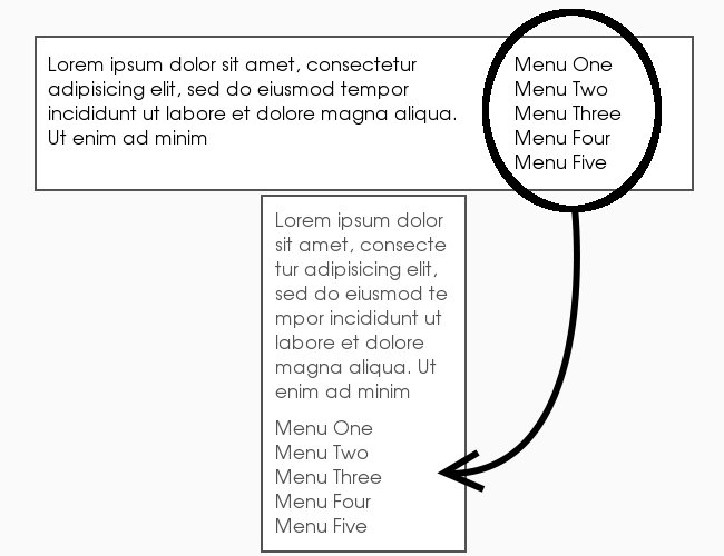
In HTML, it would look like this:
<div class="gridflair">
<div class="set8grid break_at_320">
Lorem ipsum dolor sit amet, consectetur...
</div>
<div class="set4grid break_at_320">
Menu One<br />
Menu Two<br />
Menu Three<br />
Menu Four<br />
Menu Five<br />
</div>
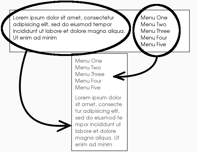
</div>What If I Want To Put The Last Column On Top?
There would be instances that the default ordering is not what you need. For instance, you might want the right sidebar to go on top, instead of the bottom. With this special need, GridFlair offers another class names which break the columns in reverse order.
The HTML code takes a little different style (notice that we appended "_reverse"), see example below:
<div class="gridflair">

	<div class="set4grid_reverse break_at_320_reverse">
		Menu One<br />
		Menu Two<br />
		Menu Three<br />
		Menu Four<br />
		Menu Five<br />
	</div>

	<div class="set8grid_reverse break_at_320_reverse">
		Lorem ipsum dolor sit amet, consectetur...
	</div>

</div>
The above HTML code renders on the desktop and on mobile devices like this:
Use Custom.css File to Control Other Elements
GridFair does not control other web page elements. Headings (h1, h2 tags) and paragraphs are beyond the scope of GridFlair. To go around this situation, and to have better control of the web page the designer still has to create the css stylesheet for all the tags and design parameters common for all pages. This is the reason that custom.css is called outlast, after GridFlair.
It helps to remember that GridFlair only breaks columns at certain screen sizes.
For completeness, the following are examples for possible ways to control elements as they would appear in different screen sizes.
Among other things, you need to put inside the custom.css file, the following media query expressions:
@media only screen and (max-width: 1000px) {
}
@media only screen and (max-width: 800px) {
}
@media only screen and (max-width: 580px) {
}
@media only screen and (max-width: 320px) {
}
These will allow better control of the web page elements even with different screen sizes.
Example 1: Changing the font size for different screen sizes
body {
	font:normal 62.5% Verdana;
}
h1 {
	font-size:3em;
}
@media only screen and (max-width: 1000px) {
	h1 { font-size:2.6em;}
}
@media only screen and (max-width: 800px) {
	h1 { font-size:2.4em;}
}
@media only screen and (max-width: 580px) {
	h1 { font-size:2.2em;}
}
@media only screen and (max-width: 320px) {
	h1 { font-size:2em;}
}
With the code above, the H1 heading font sizes would be kept in the following sizes:
- font size at 30px for screen 1001px and above
- font-size at 26px for screen size of 801px to 1000px
- font-size at 24px for screen size of 581px to 800px
- font-size at 22px for screen size of 321px to 580px
- font-size at 20px for screen size of 320px and below
Example 2: Adding CSS control for element with an ID selector:
body {
	font:normal 62.5% Verdana;
}
h1 {
	font-size:3em;
}
#header {
	margin:30px;
}
@media only screen and (max-width: 1000px) {
	h1 { font-size:2.6em;}
	#header {margin:2.4em;}
}
@media only screen and (max-width: 800px) {
	h1 { font-size:2.4em;}
	#header {margin:2em;}
}
@media only screen and (max-width: 580px) {
	h1 { font-size:2.2em;}
	#header {margin:1.8em;}
}
@media only screen and (max-width: 320px) {
	h1 { font-size:2em;}
	#header {margin:1.6em;}
}
The code above tells the browser to follow the margin spaces according to the following screen sizes:
- Margin should be 30px for screen 1001px and above
- Margin should be 24px for screen size of 801px to 1000px
- Margin should be 20px for screen size of 581px to 800px
- Margin should be 18px for screen size of 321px to 580px
- Margin should be 16px for screen size of 320px and below
Example 3: Adding CSS control for elements with a class name selector.
body {
	font:normal 62.5% Verdana;
}
h1 {
	font-size:3em;
}
#header {
	margin:3em;
}
.searchbox {
	padding:3em;
}
@media only screen and (max-width: 1000px) {
	h1 { font-size:2.6em;}
	#header {margin:2.4em;}
	.searchbox { padding:2.4em;}
}
@media only screen and (max-width: 800px) {
	h1 { font-size:2.4em;}
	#header {margin:2em;}
	.searchbox { padding:2em;}
}
@media only screen and (max-width: 580px) {
	h1 { font-size:2.2em;}
	#header {margin:1.8em;}
	.searchbox { padding:1.8em;}
}
@media only screen and (max-width: 320px) {
	h1 { font-size:2em;}
	#header {margin:1.6em;}
	.searchbox { padding:1.6em;}
}
The above code tells the browser to follow the space padding below:
- Padding should be 30px for screen 1001px and above
- Padding should be 24px for screen size of 801px to 1000px
- Padding should be 20px for screen size of 581px to 800px
- Padding should be 18px for screen size of 321px to 580px
- Padding should be 16px for screen size of 320px and below
Customizing GridFlair - Adding Breakpoints and a Default Override In Your Custom.Css File
Each project has its own personality, including different or unique requirements. For these there might be a need to override the GridFlair default system, or to create additional controls for the content to reflow correctly.
Below are some ways to customize or override Gridlair:
Creating Your Own Breakpoint
GridFlair doesn't support all breakpoints. However, inside your own custom.css file, you have the ability to add your own breakpoint.
Example:
@media only screen and (max-width: 912px) {
	.break_at_912 {
		width:100%;margin:1% 0%;
	}
}
@media only screen and (max-width: 126px) {
	.break_at_126 {
		width:100%;margin:1% 0%;
	}
}
Once these have been added, you can use these in the same manner as the GridFlair breakpoints.
<div class="gridflair">

     <div class="set6grid break_at_912">

          Lorem ipsum dolor sit amet, consectetur adipisicing elit

     </div>

     <div class="set6grid break_at_912">

          sed do eiusmod tempor incididunt ut labore et dolore magna aliqua

     </div>

</div>
<div class="gridflair">

     <div class="set6grid break_at_126">

          Lorem ipsum dolor sit amet, consectetur adipisicing elit

     </div>

     <div class="set6grid break_at_126">

          sed do eiusmod tempor incididunt ut labore et dolore magna aliqua

     </div>

</div>
Then, controlling other web design elements will make use of the same media query block, like the following example:
@media only screen and (max-width: 912px) {
	.break_at_912 {
		width:100%;margin:1% 0%;
	}
	h1 { font-size:2.6em;}
	#header {margin:2.4em;}
	.searchbox { padding:2.4em;}
}
@media only screen and (max-width: 126px) {
	.break_at_126 {
		width:100%;margin:1% 0%;
	}
	h1 { font-size:2em;}
	#header {margin:1.6em;}
	.searchbox { padding:1.6em;}
}
Controling Images Within GridFlair
Images do not handle scaling well. An image downscaling from original size of 350 pixels to 100 pixels will not experience any quality degradation. On the other hand, a picture resized from it's original 100px width to 350 pixels will encounter pixelation.
The code below overrides this default. Instead the browser will use the image's actual size as the maximum dimensions for resizing. Downscaling is allowed as it has no ill effects. Add the line below to your custom.css file to override the default:
.gridflair img {width:auto;height:auto;}
Another way to do it would be with the use of a separate ID name or a new class to control selected images.
Example 1: using the width and height property
#logo img {width:auto;height:auto;}
.readbtn img { width:auto;height:auto;}
Example 2: using the max-width and max-height property
#logo img {max-width:300px;height:auto;}
.readbtn img { max-height:70px;width:auto;}
Max-width simply tells the browser to stay at maximum 300px width. Same with max-height.
Example 3: using the min-width and min-height property
#logo img {min-width:300px;height:auto;}
.readbtn img { min-height:50px;width:auto;}
Min-width simply tells the browser to never go below 300px width. Same with min-height.
Example 4: using combination of max-width, min-width, max-height, and min-height property
#logo img {max-width:300px;min-width:250px;height:auto;}
.readbtn img { max-height:70px;min-height:50px;width:auto;}
Another way to control design elements is the use of in-line style.
<img alt="" src="" style="max-width:300px;" />
Dealing With Older Versions Of Internet Explorer
Media query is supported on Internet Explorer 9, but not on older versions. Without media queries it would be hard to implement a responsive website. However, there are different ways of handling older versions of IE.
Option 1: - Degrade gracefully using fixed width layout, totally disregarding responsive design in old IE browsers. Responsive design may not be needed for older versions of IE since mobile devices don't use old IE. Logically there's no need to waste time.
Option 2: - Include polyfill javascript library to your HTML. By using it, IE8 and below will be forced to honor min/max-width properties and therefore allow GridFlair to perform its responsive feature. Examples of polyfill scripts are Respond.js, CSS-Mediaqueries.js, and Webshims Lib. However, dealing with them is beyond the scope of this tutorial. We recommend googling for tutorial regarding the use of polyfill.
The choice whether or not to disable responsive feature for lower versions of IE is totally up to you. For the purpose of this tutorial, disabling responsive feature on IE8 and below is the one we recommend. User experience is far more important than delivering the same looks. The design might be different from that of the responsive one but the goal should be to deliver equally positive user experience.
Remember at "The Fun Part - Writing The HTML code" section, we used this code below:
<!doctype html>
<!--[if lt IE 9 ]> <html class="ie"> <![endif]-->
<!--[if gte IE 9 ]><!--> <html> <!--<![endif]-->
The above lines could be further dissected for more specific versions of IE. The lines instruct IE browsers to use css stylesheets depending on the version of IE being used. Other conditions for IE version specific issues could also be included with this method.
<!--[if IE 6]>
... for ie6 only
<![endif]-->

<!--[if IE 7]>
... for ie7 only
<![endif]-->

<!--[if IE 8]>
... for ie8 only
<![endif]-->

<!--[if IE 9]>
... for ie9 only
<![endif]-->

<!--[if gte IE 8]>
... for ie8 and higher
<![endif]-->

<!--[if lt IE 9]>
... for ie versions lower than 9
<![endif]-->

<!--[if lte IE 7]>
... for ie7 and lower
<![endif]-->

<!--[if gt IE 6]>
... for ie greater than version 6
<![endif]-->

<!--[if !IE]> -->
... for browsers not IE
<!-- <![endif]-->
The following code tells that if IE is less than 9, then use a separate class name ".ie".
<!--[if lt IE 9 ]> <html class="ie"> <![endif]-->The following line tells that if IE is version 9 or higher, then there is no need to specify a separate class name. GridFlair and media queries will work just fine.
<!--[if gte IE 9 ]><!--> <html> <!--<![endif]-->The key point here is the class name ".ie". After you provide the instructions for IE what to do depending on the version, you need to provide the class name in your custom.css file, otherwise the condition will become useless. Basically, we tell the browser "OK, use class name .ie if you are IE lower than 9".
Inside the custom.css file (preferrably at the bottom) we will include the following styles:
.ie .wrapper{width:700px;margin:auto;overflow:auto;text-align:center;}
.ie .break_at_1000{width:100%;margin:1% 0%;float:none;}
.ie .break_at_800{width:100%;margin:1% 0%;float:none;}
.ie .break_at_768{width:100%;margin:1% 0%;float:none;}
.ie .break_at_580{width:100%;margin:1% 0%;float:none;}
.ie .break_at_568{width:100%;margin:1% 0%;float:none;}
.ie .break_at_480{width:100%;margin:1% 0%;float:none;}
.ie .break_at_320{width:100%;margin:1% 0%;float:none;}
/* do not forget to add your own breakpoint here */
.ie ul li {text-align:left;}
.ie body { ... add your style here... }
.ie h1 { ... add your style here... }
.ie p { ... add your style here... }
The above style effectively sends a single-column fixed width web page to users of IE 8 or below.
Some Note About Slideshow
Some slideshow scripts may not work well with responsive designs. This is due to the slideshow plugins using fixed div containers.
Fortunately, there is GF Fluid Slideshow that you can use to add a fluid slideshow to your responsive website.
Some Real World Concerns And Some Suggested Solutions
Responsive web design's promise of a "one-size-fits-all" codebase does have some issues. The main concern with a single code for all devices is that it does not account for the processing power and capacity of these devices. A desktop or a powerful tablet with a multi-core processor might be able to handle the web pages without any problem. However, there are a lot of other mobile devices which are significantly less powerful.
Another concern is the use of "fluid images". Responsive web design reads the screen dimensions from the device and resizes images accordingly. Since the web images are designed to be viewed with larger monitors, these would have large dimesions with a correspondingly large file size, and these are downloaded to a small mobile device and shrunk to the appropriate size on the page. This unnecessary download of large files which are larger than the device's screen dimensions uses up more resources in bandwidth and download times. The images also take a lot longer to render on the mobile device.
Some Suggestions
- Keept it Simple - when designing your website it also helps to have a minimal design. This further help keep the code small and tight.
- Design your website using small images. Banners and headlines for the typical website are usually larger than the available mobile device screen. Try to use a small logo on the left of the page rather than a big rectangle image on top.
- Optimize images. You can experiment with various settings on different photo editing software or try smushit.com to decrease the filesize using lossless compression without affecting the quality of the image.
- Optimize pages to improve load time. Compressing, combining and minimizing your css, javascript and HTML file helps improve overall page load time. Another way to optimize is the use of browser caching. If possible, use CDN for distributed content delivery which results in faster page loading. Here are some more tips to optimize your website's page loading, and here's free page performance tool to test web page load time.
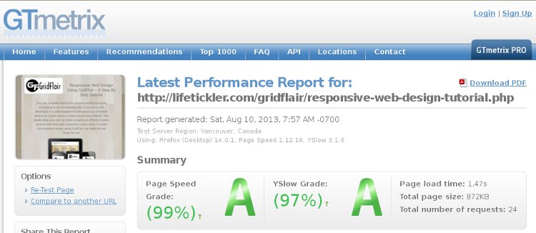
The official Gridflair homepage, loads in 1.07 secs.
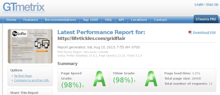
This Gridflair tutorial page loads in 1.47 secs.
- Consider responsive design combined with adaptive approach. Use javascript to detect the screen width and load only the appropriate stylesheets and images. We will discuss this in details below.
Responsive Design Combined with Adaptive Approach
It is possible to combine adaptive approach with responsive design to boost performance. Javascript would be used to query the screen dimensions, and the appropriate web page stylesheets and images would be sent to the mobile device. The following code gives an idea of this approach:
<script type="text/javascript">

	function getcss(cssfile){
	 loadcss = document.createElement('link')
	 loadcss.setAttribute("rel", "stylesheet")
	 loadcss.setAttribute("type", "text/css")
	 loadcss.setAttribute("href", cssfile)
	 document.getElementsByTagName("head")[0].appendChild(loadcss)
	}

	if(screen.width <= '320') {
		getcss('mobile.css');
	} else if(screen.width > '320' && screen.width <= '580') {
		getcss('tablet.css');
	} else {
		getcss('desktop.css');
	}

</script>
The above javascript code tells the browser to load appropriate stylesheet depending on the size of the device.
Alternatively, you may use a different approach in the following code, where the correct image size is sent based on the screen width:
<script type="text/javascript">
        function load_image(filename,altext){
                if(screen.width <= '320') {
                       document.write('<img alt="'+alttext+'"
src="'+filename+'_mobile.jpg" />');
                } else if(screen.width > '320' && screen.width <= '580') {
                       document.write('<img alt="'+alttext+'"
src="'+filename+'_smartphone.jpg" />');
                } else if(screen.width > '580' && screen.width <= '800'){
                       document.write('<img alt="'+alttext+'"
src="'+filename+'_tablet.jpg" />');
                } else if(screen.width > '800') {
                       document.write('<img alt="'+alttext+'"
src="'+filename+'.jpg" />');
                }
        }
</script>
Then anywhere in your body where you need to put an image, you can use the javascript function below to use the appropriately sized image:
<script type="text/javascript">load_image('sample alt text','filename')</script>
The above approach may not always work as not all mobile devices support javascript. Other groups have been working on this image issue and there have been some successes. One approach you might want to look at is from Responsejs.com. Responsesjs.com has taken into account graceful degrading on disabled javascript therefore their library merits a study.
Helpful Tools To Enhance Your Responsive Website
- Webshims Lib - A modular capability-based polyfill-loading library that helps developers write modern, interoperable and robust code in all browsers (including old versions).
- Respond.js - The goal of this script is to provide a fast and lightweight (3kb minified / 1kb gzipped) script to enable responsive web designs in browsers that don't support CSS3 Media Queries - in particular, Internet Explorer 8 and under.
- CSS-Mediaqueries.js - A JavaScript library to make IE 5+, Firefox 1+ and Safari 2 transparently parse, test and apply CSS3 Media Queries.
- Quality jquery plugins for responsive website - For jQuery users, there are a good number of responsive design plugins and here is a carefully collected and well-categorized list to bookmark and hit back when you are about to design responsively websites.
- Image Optimizer - A free online tool for resizing and compressing your digital photos and images for displaying on the web in forums or blogs, or for sending by email. Completely Free. No software to download.
- CSS Minifier - A tool to keep your CSS file size to minimum.
- Javascript Minifier - A tool to minify your Javascript.
- Yahoo Smush.it - A lossless optimization techniques specific to image format to remove unnecessary bytes from image files.
- GTmetrix - A free tool that analyzes your page's speed performance.
- Webpagetest - A free website speed test from around the globe using real browsers at consumer connection speeds with detailed optimization recommendations.
- CSS3Gen - Allows you to easily generate useful snippets of CSS3 and copy them straight into your projects.
Other Responsive Web Design Framework To Help You Create Responsive Website
Other than GridFlair, there are several responsive CSS frameworks to choose from. It's great to mention them here because the author believes they are also cool.
- 34Grid - by Kemal Yilmaz
- ResponsiveGridSystem - By Graham Miller
- CSSGrid.net -
- Responsive GS - By Denis LeBlanc
- GridPak - Created by Erskine Design
- Twitter Bootstrap - Created By Twitter
- GetSkeleton - By Dave Gamache
Finally!
A webpage which interacts with the target device merits an elegant approach. The search for elegant code is a neverending quest for programmers. A "one-size-fits-all" webpage created with this in mind respects the device and user, and is a great experience for the developer. It is a hard task, but GridFlair makes this a little bit easier. Another benefit of using GridFlair is the compliance with Google's "One Content" policy, assuring high ranking for your site. Besides code elegance and Google compliance, the use of GridFlair and responsive approach helps in future-proofing your site for future mobile devices.
I hope that this article gives you an appreciation of responsive web design and a better understanding of GridFlair, as well as provide you a new skill in creating one-size-fits-all websites for desktop, tablet and mobile devices.